Features
Features |
|||||
|
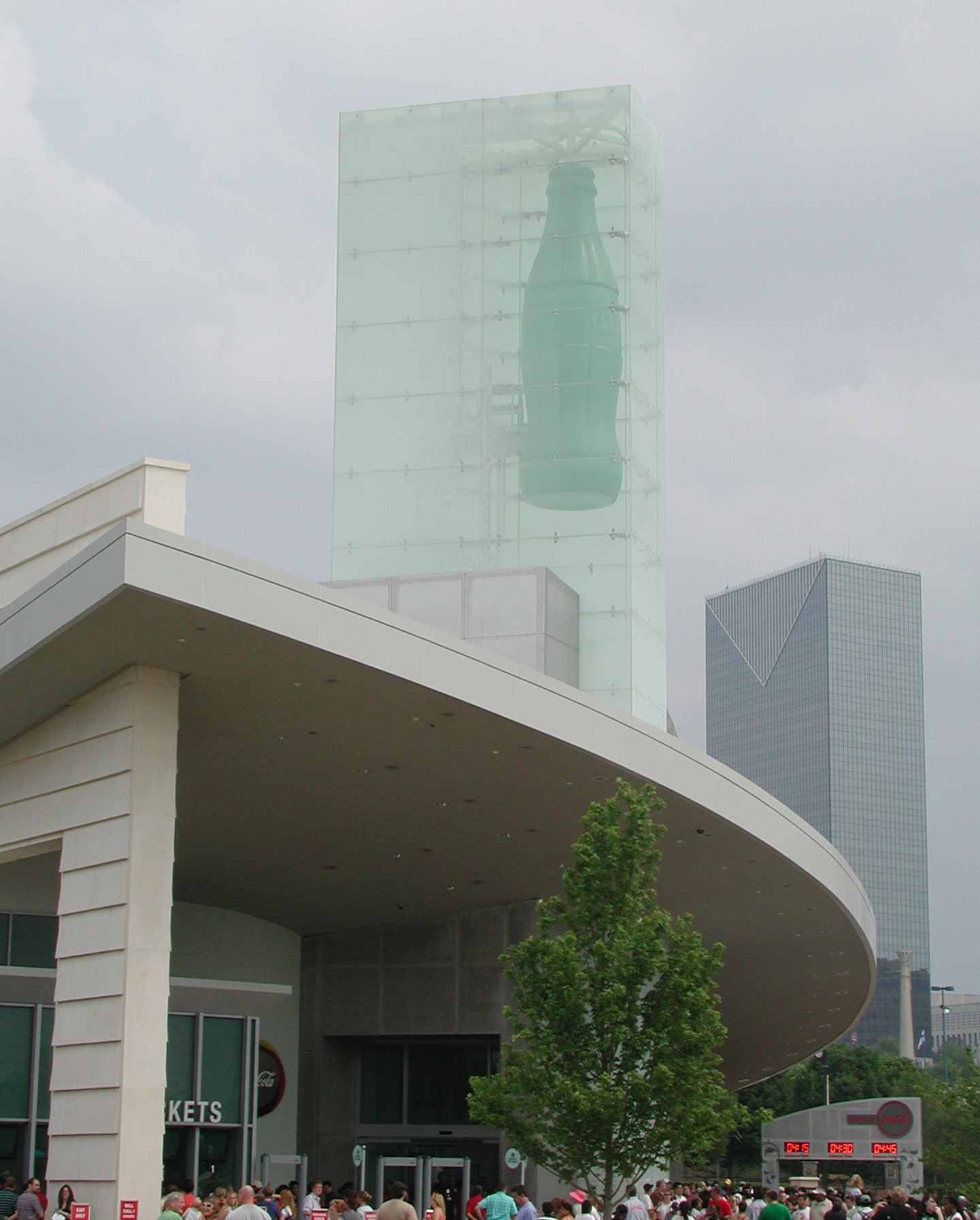
by Philip Auslander It would be easy enough to critique the NEW World of Coca-Cola, in downtown
Atlanta, where Coca-Cola was invented in 1886 and its corporate headquarters remains today. After all, the place is basically
a walk-through advertisement for a mega-corporation. But the simple fact is that a recent visit on a busy Saturday was a lot
of fun—two diverting hours that included film showings, beverage tastings, exhibitions of art and artifacts, and programs
from Coca-Cola’s archive of innovative television commercials. In any case, the NEW World of Coca-Cola is right across
a grassy mall from the Georgia Aquarium. And whereas that attraction claims an educational mission, it is in fact a Disneyfied
celebration of a lesser corporate giant, Home Depot. The Aquarium’s official mascot, star of one of the films shown
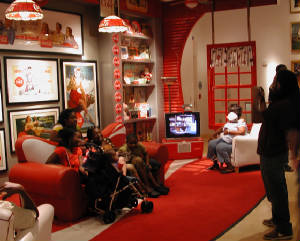
there and ubiquitous as a plush toy, is a suspiciously clownfish-like orange sea creature named Depo. Need one say more? It seems safe to say that the NEW World of Coca-Cola does not exist to sell the company to you. If you’re willing to pay for admission, you probably have already bought into the idea that Coke—both the company and its products—are interesting and wonderful. That said, the venue does convey an unsubtle, yet somewhat contradictory, message: Coke is a universal experience common to all of the peoples of the earth that, potentially, could bring everyone together in peace. Remember that commercial: “I’d like to teach the world to sing/In perfect harmony”? The main contradiction is that Coca-Cola actually is not a uniform product throughout the world. It is well known, though not discussed at the NEW World, that the formula for Coke is different in different places to match local tastes. The company’s versatility is displayed dramatically in the tasting room, where one can sample products made exclusively for overseas markets: Beverly, a bitter chinotto-like soda for Italy; a melon-flavored Fanta for Israel, and so on. Whereas Coke ideology stresses unity through uniformity, its true motto must be: Think globally, act locally. Outside the tasting room, the emphasis is not so much on the products themselves as on their production, presented in a rather claustrophobic automated model production line, and marketing. Especially marketing. The NEW World is stuffed full of old soda vending machines and every other thing that ever served as a surface on which a Coke logo or advertising image could be placed. Coke has never been out of step with trends in visual culture. In the 1920s, Coke went Deco. In 1931, the company commissioned a painting from Norman Rockwell, Barefoot Boy, to be reproduced on its trays. An animated commercial from 1969 evokes Peter Max. By contrast, the entertaining animated film that is compulsory viewing at the NEW World, in which the voices of Coke employees emerge from the mouths of animals and other fanciful figures, is in the spirit, if not the visual style, of the British Aardman Animation’s Creature Comforts series. In the Pop Culture Gallery (get it?) one encounters, alongside a variety of collectibles and other artifacts, a small exhibition of Coke-themed work by Andy Warhol, on loan from the Warhol Museum in Pittsburgh (some of the objects will be exchanged for others later in the year). Two are line drawings from the 1950s, when Warhol worked as an illustrator, in which Coke bottles serve as flower vases. There are two of Warhol’s Screen Tests showing on a video monitor: of David and Nico (the singer from the Velvet Underground), both from 1966. The remaining works are from the 1980s, including two small black and white photographs—one of stacked up crates full of empty Coke bottles, the other of piles of Coke logo T-shirts—reminiscent of his earlier rows of Campbell’s Soup cans. There are also two deadpan color Polaroids from 1984 of a spilled Coke can, dribbling its contents onto the floor, and two screenprints of the same subject. These were commissioned for the cover of Time Magazine to announce the arrival of New Coke, but the product was withdrawn and the cover never ran. It’s almost as if Warhol predicted its failure with his abject image of accident and waste. The Warhol showcase is probably intended to demonstrate the iconicity of Coke, its logos and classic bottles, an iconicity that transcended advertising and made its way into fine art through Warhol (among others), who had done the same thing himself. But the Warhols also resonate with other things on display. The philosopher and art critic Arthur C. Danto compares Norman Rockwell with Warhol: “he was not just a painter of recognizable things. Norman Rockwells were themselves recognizable things. They were part of the world. They were not just illustrations of reality. They were part of the reality of his times. Anybody in America could pick them out like stop signs or American flags. The only other artist of whom something like this is true is Andy Warhol.” Yet it remains much easier to accept Warhol as a “real” artist than Rockwell, despite various efforts at rehabilitation. The NEW World of Coca-Cola, a space filled with the kind of instantly recognizable objects that both Rockwell and Warhol took as their subjects, is an appropriate place to ponder the thin line between “fine” and “commercial” art. Rockwell, Warhol, and Coke all demonstrate that a signature visual style can be simultaneously cultural iconic and richly commodifiable. It’s a bit jarring to see Nico disaffectedly downing a Coke in her screen test next door to a host of sunny and, usually, sentimental commercials. The Screen Tests are a series of short, silent, black and white films for which visitors to Warhol’s Factory studio and members of his entourage would sit facing a stationary camera and try to remain motionless (in fact, Nico did not even try). This was the era of “Things go better with Coke,” a jingle sung by pop artists like Jay and the Americans and Petula Clark, a far cry from the Velvet Underground’s heroin anthems (though it is only fair to note that it was also performed by the grittier Ray Charles and the trippier Moody Blues). Moving between the Pop Culture Gallery and the Perfect Pauses Theatre, where the commercials are screened, one can see films celebrating the brightly colored, Coke-infused mid-1960s juxtaposed with others that emerged from the much darker, languid bohemia of Warhol’s Factory. To the left of the cluster of Warhols in the Pop Culture Gallery is a case containing objects of Coke-related crafts made by regular folks, and to the left of that is a wall featuring an assortment of Coke-themed images made by certified folk artists, including a pair of Howard Finsters (Warhol was a major collector of American folk art). We are presented with a range of possibilities for making art out of Coke and invited to ponder the similarities and differences. I was reminded of an article I once saw from a crafts magazine of the 1960s showing how to make your own Pop Art by lacquering a soup can. Where are the lines? What is the difference between Warhol’s uses of Coca-Cola bottles and logos and those of the hobbyists? Between the hobbyists and the folk artists? Is there some kind of continuum being implied? One of the first images in the collection of Warhols is of Andy himself—a large color Polaroid from 1979 in which he looks out at us with that patented deer-in-the-headlights stare. He is wearing two badges that identify him as a Visitor (to Polaroid, as it happens). This makes him one of us: like Andy, we are all visitors to the World of Coke, both inside the building and outside of it. I can’t help thinking that Andy would like the idea not only of being in something called a Pop Culture Gallery sponsored by Coca-Cola but also of sharing it both with the guy who made an Irish harp out of a large plastic promotional Coke bottle and the Reverend Howard Finster.
http://lcc.gatech.edu/~auslander Philip Auslander teaches performance studies at Georgia Tech.
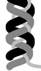
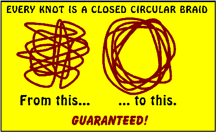
by John Perreault I. What Art Was In the summer of 2004 when I was teaching an introduction to contemporary art at the Anderson Ranch near Aspen, in Colorado, I came up with two ideas that I felt would help make sense of the confusion that prevails. Are we in a post-pluralist free-fall? Which direction is up? Who threw out the baby with the bath? I was not convinced that art history and the art world were finished, yet the art world seemed at an impasse. Pluralism, long confused with anti-Leninist socialisms or, on an even deeper level, with polytheism, had been cast aside. Art was tied up in a knot, with no clear prerogatives and certainly without direction. But the term “direction” implies the dreaded Master Narrative that we have all tried to deconstruct, inadvertently letting it be replaced by…..the Market? Perhaps it was not the end of art history, but the end of a certain restricted art history. Perhaps it was not the end of the art world, but the end of a certain kind of art world. I, of course, knew it was all rhetoric. Or as the Dadaists used to say, art is dead; long live art. I myself had opined that the art world as I had known it (or imagined it) -- the idealistic art world -- was over sometime round 1980 when the domination of market values became visible. I thought the craft and design worlds might be exempt from cynicism and could still retain some idealism. I was not entirely right; I was not entirely wrong. Let us just say that “centering” in clay has never entirely replaced self-centeredness, and that wherever there is something to be sold, there is salesmanship and jockeying for positions near the entrance to the fair. Wherever there is money to be made, there is collusion and double-dealing. And gambling -- which seems to be what buying art of any kind is now about -- is universal. But the art endings never end. Some might backdate all these endings to Friedrich Hegel. Certainly critic Donald Kuspit, who reportedly studied with Theodor Adorno, had something like that in mind when he titled his 2004 effort The End of Art. But did Arthur Danto, with a very different philosophical take, intend such a reference with his 1996 After the End of Art? Or the same for Robert Morgan, with his 1999 End of the Art World? I doubt it. Eva Geulen’s 2006 The End of Art: Readings in A Rumor After Hegel, most certainly did. Since two of the authors (Danto and Morgan) are friends of mine, I hope they and the others are not alluding to Francis Fukuyama’s dismal The End of History and the Last Man (1992). Fukuyama defined history as a meaningful order to events. What does he mean? That B following A is logical or proves benevolent design in the universe? Perhaps he meant that the inevitable and the teleological are to be preferred to freedom. Like trendy novels that no one really reads -- or hip detective stories that are read -- collections of art criticism need catchy titles. Although Air Guitar (1997) by Dave Hickey is one of my favorite titles, I thought I, given my cheerful nature, would stick to the dire and doomed. How about In the Wake of Art? Or Art after the Apocalypse? My current preference is What Art Was. But, whether one likes it or not, art is far from over. It is everywhere, done by all. Hedge-fund nerds follow the auctions as if they were horse races or baseball games. Yet critics still go about with sandwich boards stating “The End Is at Hand.” I had begun to see the error as one, not of sour grapes (“My horse did not win, so the race is fixed!”), but of believing in the wrong game or a mistake of picturing. II: A Modest Proposal Many in academic circles complain about linear art history, but few propose an alternative. Most art criticism and art history serves the art market, intentionally or not. Since linear history is easy to conceptualize, is pervasive, suggests inevitable outcomes, and is therefore an excellent sales tool, it dominates discourse. Unfortunately this convenient set-up blocks the complexity and richness of contemporary art, even for those who should know better. For my class at Anderson Ranch, I concocted two exercises that I hoped would be therapeutic. Since I had not yet created my essay website Artopia (where the motto is “Art as It Should Be”), I was desperate. How could we cut the Gordian Knot? The first exercise was to construct alternative art histories, like the science-fiction subgenre in which the South has won the War Between the States or JFK was not assassinated. This, I thought, would serve to loosen the stranglehold of inevitability. Besides, it was quite entertaining. What if Robert Rauschenberg had not asked Leo Castelli to make a studio visit to Jasper Johns? What if the Sculls had not sold their Pop Art at auction? What if Andy Warhol had stayed in Pittsburgh? What if Frank Stella had not married Barbara Rose? What if de Kooning rather that Pollock had died in a car crash? What if John Perreault had become the editor of Artforum? The second exercise turned out to be less amusing but more important. What if the current rigidity and defeatism were not caused by the critics, the curators, and the historians but by their image of history? What is that image? It is linear, a one-way street, rather than a freeway with overpasses and underpasses going in multiple directions. In reality, all roads do not lead to the Museum of Modern Art or, more correctly now, to Sotheby’s and Christie’s. Can we find another image? One has to start from zero. Change comes about only through new principles. I realized the picture everyone was using was wrong. Picturing determines how we think and even how we perceive. The models and diagrams we make may help us see, but if we are not careful they become laws and limits. In order to break out of the linear, evolutionary accounts, one has to picture a different model, a better diagram. Are there any ways of picturing history, and therefore art history, other than a steadily rising single line – rather like the simple evolutionary model that shows “slime-to-mankind” in easy stages? Does art history always have to be Egypt to Athens to Rome to Paris and then New York? And now Beijing? Could there be other ways of looking at things, even now? A circle is too Vedanta, too Nietzschean. But a spiral? Styles could be shown to circle back while moving ahead. Here, right away, words get in the way. A line is easier to say. On the other hand, a spiral is just a line that runs around an axis without returning to its origin, but moving a little bit forward with each circle. Then, looking for spirals on the Internet, I stumbled upon the DNA double helix, which suggested the Greek caduceus. Many take the caduceus to be the sign for medicine and/or healing but it is actually the sign for commerce. Although this might be almost too appropriate for both contemporary art and contemporary medicine, there is that annoying staff the snakes entwine. (The real sign for medicine and healing was the rod of Asclepius, which depicts one snake coiling around a rod.) The double helix has a more contemporary resonance, and there is no central staff, shaft, rod. But could the double helix cure art history? One snake or strand could be abstraction and the other representation. One snake could be religious art and the other political art. One snake could be painting and the other sculpture. One could be craft and the other concept. This might be helpful, but it is certainly dualistic. A double helix is not quite complicated enough to act as a conceptual tool because we are left with a Manichean battle between good and evil, recast as abstraction against representation, or severity against decoration, or poetry against painting. A braid, however, can contain many strands. It can stand for a much more complicated situation than can a double helix. If you can picture a braid then you can grasp the relationships among many kinds of art, many styles and many art factors moving through time, sidestepping the usual two-step or tennis match. By the time I’d prepared a full-blown PowerPoint presentation for a series of lectures at the Phoenix Museum of Art, I was ready to show a picture of a Celtic/Islamic “knot” as a braid in which strands are joined into one looping, interlacing strand, going back on itself. Long live Nietzsche’s eternal return! Even a cursory dip into knot theory (an arcane mathematical pursuit) will reveal that it overlaps with braid theory (an equally arcane pursuit). One of the theorems in knot theory is that “Every knot is a closed circular braid.” So, at least metaphorically, to untangle the knot of contemporary art one need only perceive the knot as a braid pulled too tight. (I, of course, am prepared to go further and reimagine time itself, but that would burst the borders of the present discussion and lead into physics and metaphysics.) In the meantime, one can profit from looking at history itself as a braid, therefore allowing an image that can handle the interactions among several cultures over time: European, the Middle Eastern, Asian, The Pacific, and of the so-called New World. It turns out I am not alone in my push for reimagining or reconceptualizing art history. Artist and critic Mark Staff Brandl, in his recent review of David Carrier's book The Aesthetics of Comics, proposed not the posthistorical but the polyhistorical, citing Swiss media-theorist Christian Doklker’s proposal to see history as interwoven stories or histories – and, therefore, as plurogenic rather than monogenic. In the meantime, the braid helps us see factors assigned to different strands as overlapping and touching, influencing, occluding, interfering, and/or interacting. In short, we have been stuck with using the wrong diagram, one descended from Darwin, then Marx, then nearly every academic critic since Clement Greenberg -- who, although not an academic, had once been a Trotskyite. There is also hell to pay when it comes to the influence of religion. The New Testament was intended to prove Jesus of Nazareth was the Messiah predicted by the Old Testament. Then too, let us not let Madame Blavatsky off the hook. Her cosmology – and therefore the cosmology of Mondrian, Kandinsky and Malevitch (and Pollock who flirted with Theosophy as a teenager) -- tends to make slime-to-the-divine evolution seem preordained. III: Unlearning the Past So what else will the braid model accomplish? It will help us “picture” some very complicated relationships. A few have already noted some similarities between Hardcore Pop and High Minimalism, such as finish and cool. But why leave out the Photo-Realism of Richard Estes, early Audrey Flack, and Chuck Close? If we see realism as a third strand, more interrelationships are much easier to grasp. As someone with an abiding interest in ceramics and other craft-based art forms, I have tried to show relationships between craft and so-called fine art. A double helix image can help; but why not braid architecture, design and craft along with painting and sculpture? We then would have a way of seeing how Paris School painting and Picasso’s ceramics decoration rubbed off on the craft strand in, let’s say, the ceramics of Henry Varnum Poor. Later we can see how architecture by Keisler, paintings by de Kooning, and ceramics by Peter Voulkos are intertwined. Pop in its West Coast incarnation crossed under or over ceramics and yielded Arneson and others. We can also mix strands. One strand can equal representation, another abstraction, and then we can have a strand for impersonal paint handling and one for painterly painting. We might be able to see de Kooning’s women looping over Hard Edge to influence Realism as it becomes Hardcore Pop or before that looping over Dada and Cage to become Proto-Pop in Rauschenberg, Rivers, Dine and Johns. In more contemporary terms, we can weave Realism into the Pop and Dada strands returning further down the braid as Neo-Geo (or as Jeff Koons and Damien Hirst), having touched the Minimalism strand along the way. Thus, by using my braid device, we have turned diagramming into describing rather than proscribing. Most important, the braid allows us to see several kinds of art simultaneously. Linear accounts, on the other hand, must exclude everything that doesn’t quite fit. In the standard account of Minimalism, West Coast versions are appended, not integral. Only recently have we been forced to footnote the Brazilian Neo-Concretists. I remember when the rule of thumb for art innovation or product development was always to do the opposite of what was getting the most attention. If big was big, think small. If hard geometry was the winner, try soft and messy next. If abstraction was at the top of the heap, go for realism. Now, as clocked on Artopia, we have revivals everywhere. Students routinely pillage art history, bouncing off art that’s older than what their teachers make. There is so little worthwhile new art product to fill the needs of the investor surge that everyone is tapping the overlooked and the scorned. Abstract painting from a period when there was not supposed to be any painting? Why not. Psychedelic Art? You bet. Even artists no longer in the first flush of youth and out of fashion may soon be brought back to life. We can see these revivals as strands that have looped back into sight. Gone but still here; once dead but now reborn. But isn’t the braid too difficult to use? The heuristic braid diagram is the visual equivalent of multitasking and polyphony, and no more difficult than these. If you can drive a car while talking on your cellphone and listening to the radio, then you can braid. If you can follow a fugue or the various voices in jazz, then you can braid.
Artist, poet, and critic John Perreault is the founder of ARTOPIA (www.artsjournal.com/artopia).
Deanna Sirlin is an artist and writer who does a balancing act between the two. |
||||||||||||