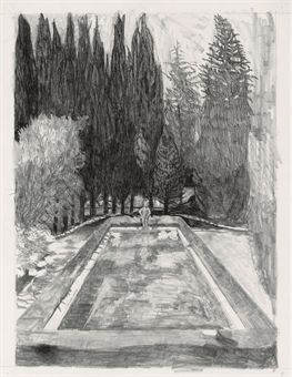
Jennifer Bartlett, In the Garden #64, graphite on paper, 1980.
Tending the Garden:
A Studio Visit with
Jennifer Bartlett
By Deanna Sirlin
On a drizzly spring morning I
traveled by subway to the home and studio of Jennifer Bartlett. She had recently moved from Manhattan to the Greenpoint section
of Brooklyn, which is becoming increasingly gentrified. I got out of the subway station and immediately fell under the spell
of the neighborhood, with its large trees and brownstone buildings.
Her
long-time assistant greeted me at the door and led me into the airy and well-organized studio with large metal tables at its
center. There was a lovely sitting area with a striped daybed and two chairs upholstered in black and white patterns with
overlapping circular shapes, a design of which I am very fond. When Jennifer came down to greet me she was also dressed in
black and white and when she took a seat on the daybed she looked like she was part of a Matisse composition.
Jennifer and I spoke about her work for a long time, and then she took me on a tour of the
garden and the rest of the studio. She is an articulate speaker and easy to talk to. She is quick and funny and exudes joie
de vivre. Some of her responses, however, seemed designed to encourage me to investigate her work on my own. When I asked
about how she begins a work, she said, “I begin the work.” What sizes do you work in? “Small, medium and
large.” So, I gladly take up the challenge.
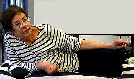
Jennifer Bartlett. Photo: Deanna Sirlin
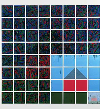
Jennifer’s pivotal work
Rhapsody, 1975-76, which was on view at the Museum of Modern Art in NYC in 2011, is composed of 987 12 x 12 inch aluminum
plates painted in baked-on enamel. Each plate is silkscreened with a grid of pale gray that the color brushstrokes sit on
and within. I love the way these work sit flat on the wall and are stacked in rows of seven so they are so much taller than
the viewer and span 147 feet. Each plate contains one of several kinds of images. Some are solid colors or brushy color fields,
while others represent landscapes, sky, clouds, or trees. Some are painted representationally. Others are depicted schematically,
or in a cartoon-like fashion, or as systems of lines and curves or geometrical shapes. The scale of the work is wonderful,
but it is the intimacy of the individual plates that seduces the viewer into staying with the work and reading it from left
to right and up and down. Both the reworking of images in different styles and the juxtaposition of monumental and intimate
scale are among the kinds of contrasts to be found in Jennifer’s work.
One
of the first books I owned that was entirely on a woman artist was Jennifer Bartlett’s In the Garden, published in 1982.
I was living in Ithaca, New York then, maybe still licking my wounds from graduate school and feeling quite isolated living
in a college town while being neither a student nor a professor. I realized later that Ithaca was anything but isolated, but
my past living experiences were only of New York City. Reading this book and looking at the 197 reproductions in it, I journeyed
with Jennifer through the process of thinking through a single motif. This view has no people, just a lush landscape with
cypress trees and a reflecting pool with a small statue of a nude boy peeing in the water at the far end. I loved this period
of Jennifer’s work. As a young artist, I felt a kinship with the idea being in a lonely place; these works conveyed
the feeling of being alone in a lush but forgotten hideaway (actually a house in France, outside of Nice). Jennifer numbered
her 200 drawings of this garden and pool with the statue standing on its rim. Each of these drawings, from 1980, is
different in its balance between abstraction and representation. The diptych format she chose makes the contrasts and juxtapositions
all the more poignant. She draws and paints in watercolor and other media the same motifs over and over again, finding a new
language for the garden, pool and statue each time.
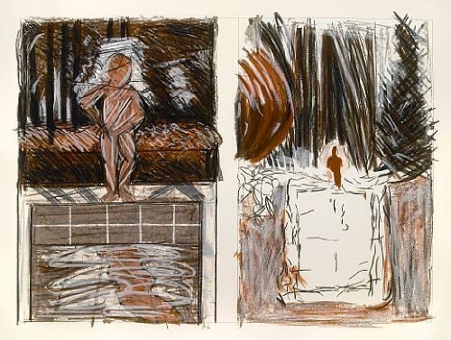
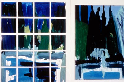
Jennifer Bartlett, In the Garden #40, screen print with woodcut in colors, 1984.
In the first drawing of this
series, Jennifer used pencil lines to partition the rectangular sheet of paper into two squares that sit side by side. The
left side is fierce, angular and geometric, while the square on the right is articulated by soft marks that build the composition
in a manner that might be considered impressionistic. Turn the page, and the next drawing retains the double square, the double
landscape and the proportions of the first, but a brown pencil has crept in to alter this variation on a theme. By drawings
#6 and #7, black ink has joined the pencils. The ink strokes are bolder, more playful, and have a greater presence. By this
point in the series, it seems that Jennifer has shaken off any inhibiting rules and the most beautiful freedom of representation
has been let loose on the page. Color arrives with watercolor and then colored pencils. The pool, the light on the water,
and the little statue come alive in the medium of gouache, which brings saturated color to the drawings. By drawing #26, Jennifer
has left the frame of the square, and the bold cypress trees at the top of the composition refuse to stay contained. Soon,
the drawings grow into two large vertical rectangles that sit side by side and fill the entire page. If this description sounds
like a narrative, it is because viewing the works in sequence creates the kind of suspense we experience from movie thrillers.
What will happen when we turn the next page?
I realize as we wander around
looking at plants and a small water garden that Jennifer’s garden reflects the same aesthetic as these drawings. A Douglass
fir is planted beside a tree of a different species to contrast rather than to blend. A long rectangular concrete tank holds
water, ready for lilies and other water plants to be cultivated. And beside it, in contrast, is a large natural rock, the
right scale to sit upon.
Jennifer Bartlett, 2 Priory Walk, enamel on silkscreen, 64 enamel steel plates, 103" x 103", 1977
Jennifer came east from California
to attend Yale in 1963. She told me she simply wanted to go to the best possible school. At Yale, Jennifer found her particular
language of painting, which is representational but also entails the breaking down of all forms to squares, rectangles and
triangles. She embraced the grid. The resulting play of abstraction and representation is evident in a work from 1976, Falcon
Avenue, Seaside Walk, Dwight Street, Jarvis Street, Greene Street, made up of 80 baked enamel steel plates over a silkscreen
grid; the total size is 51 by 259 inches. The motif of this work is a square red house with a triangular black roof set against
a blue sky, with a rectangular area of green lawn in front of it. Reading the work from left to right, we first see the house
through a veil of white that makes it seem like a distant memory. In the next version, the white is gone resulting in a more
intense image of this schematic representation of home. The next image is pointillist in style and the image starts to lose
definition. The colors begin to mix; black and blue dots run into the sections previously reserved for just red or green or
blue. By the fourth group of plates, the brushwork and color have become expressionistic; the basic unit of this image is
the stroke rather than the dot, and the work’s geometry is no longer regular. In the final image to the far right, the
house is no longer identifiable; each plate resembles those in one of the previous images.
The overall movement of the work suggests a trajectory of some kind, expressed in these shifts of style and variations
in the treatment of the image. It may be autobiographical. Falcon Avenue is a street in Long Beach, California, where Jennifer
is from—perhaps the sequence carries her from her origins on the west coast to her adopted home of Soho, New York where
Greene Street is to be found. I have always been interested in the particular kind of stylistic pendulum that swings between
representation and abstraction, in a graceful shifting between the forms and their relationship to representation. Rather
than treating abstraction and representation as opposites, Jennifer travels back and forth between them, breaking things down
into small elements she can rearrange.
Jennifer Bartlett, In the Garden III, 1982
Jennifer told me about her
early days as an artist in Soho in the Sixties. Artists were real estate pioneers in their lust for space to make their work.
It is hard to believe those lofts were ever filled with a community of artists; it was still a pretty raw place when I started
going to galleries there in the mid 1970s. Now it is like an urban mall filled with shops and restaurants and a few galleries.
However, the sense of community anchored in strong friendships among artists that originated in the 1970s still exists today.
I notice a large painting by Elizabeth Murray on the wall. Jennifer sees me looking at it and tells me of their friendship,
which lasted through many decades until Murray died of lung cancer in 2007. They met in 1962 when both attended Mills College
in California. Jennifer was a senior and Elizabeth a first year graduate student; they both came east around the same time.
Jennifer also spoke about the day-to-day life of being an artist, something she
is matter of fact about: it is simply who she is and what she does. She works in her studio, painting downstairs and drawing
upstairs. She is very prolific, making prints, drawing, paintings and photographs. This strength, and the will to rise
every morning to paint or draw—to create—is powerful. Jennifer does not dwell on it; she just gets to work. I
have seen this inner conviction in many great artists. It is there right from the beginning and stays with one until the end.
The day I visited Jennifer’s
studio, three of her large studio walls were hung with ten 48 x 48 inch evenly
spaced canvases. A 12 X 12 inch photo with the same image as each painting rested
against the wall under its companion.
The paintings were in process; about half were cityscapes of buildings
looking out over the river and the other half were hallways of some
institutional space, a doorway or corridor. Jennifer considers the entire group
to make up a single work. Upstairs in the drawing studio, as large as the
painting studio below though with a lower ceiling, are exquisite pastels of the
same views. These images were from Jennifer’s hospital stay last year, which we
spoke about, but not in depth. It must have been a difficult time for such a
lively and productive artist. There is great contrast in these new works, as in
all of Jennifer’s work, but this time the contrast is in the viewpoint. The
cityscapes are seen from a distance, while the institutional hallways are
close, abstracted and eerie. They share the darkness and melancholia of the In the Garden series. These works were
unfinished when I saw them in May of 2012, so I don’t want to say too much
about them. They could have changed in a myriad of ways by now, and I am
anxious to see them.
Deanna Sirlin is
an artist based in Atlanta. She is writing a series of profiles for TAS of living American woman artists
whose work she has been following for 30 year or more.